The source graphics for each side of this diptych are as follows:
On the left - Bryce On the right - Lion
Grass Grass
Blue Dragonfly Orange and Blue Dragonfly
Background - Grass Spider
To make the wings of the dragonflies semi-transparent I masked the entire dragonfly and then went back over the mask on the wings with the paintbrush tool on black but set to a very low opacity.
I have always likes T.S. Eliot's Old Possum's Book of Practical Cats and this quote from the poem "The Naming of Cats" seemed to fit these two images of my cats Bryce and Tuck.
I have always enjoyed these two images of Pandy as she comes up with an ingenious solution to get the last of the milk out of the glass and I felt that they made a good diyptych. I did have to do some serious color adjustments to these photos as the photos I scanned were faded. I also had to make some additional adjustments to make the colors of the right side match more closely the colors on the left side, though the left side still has bluer shades than the right side.
And just for fun here is a triptych of a chipmunk gathering peanuts from this mug on my last camping trip.
My Photoshop and Illustrator Blog
DMIS 10D Spring 2012, DM/IS 14C Fall 2011, DM/IS 10C Spring 2011
Saturday, May 12, 2012
Saturday, May 5, 2012
Advanced Photoshop HW #13
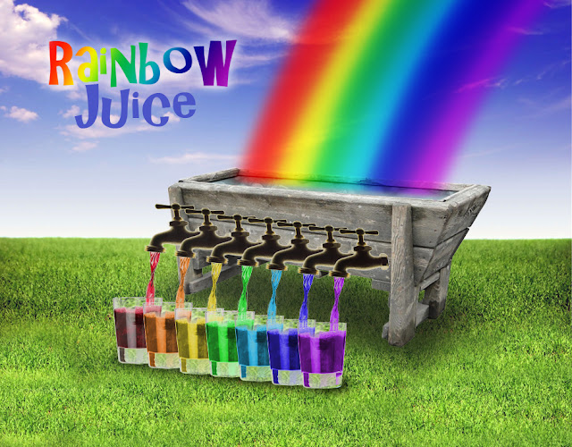
This assignment was working with translucent
objects and I had the idea of distilling a rainbow.
Working with more translucent objects the goal was to create
an inspirational scene emerging from a light bulb. I added the lightning bolt in the foreground of the image, but the bolt in the background is all mother nature.
The references for both of the above images can be found here.
Saturday, April 21, 2012
Advanced Photoshop HW #12
 I made this Acoma pot by creating a pen shape of a cross section of the shape I wanted for the pot and then bending the extrusion 360°. I then applied the balsa wood texture to the side material. After applying the repoussé I used the 3D tools to edit the texture to change the color and add the pattern.
An Isoline drawing
Thursday, April 19, 2012
Advanced Photoshop HW #11 - HDR and HDR Toning
Using the HDR method really boosted the amount of detail on this bleeding heart blossom. I was able to bring out the fine detail of the texture of blossom.
I love the amount of detail, the textures that I can reveal that were lost in the individual images.
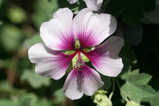 This above image is playing with the surrealistic effects that can be applied to the image.
The image to the right is mid exposure original image for the two previous images.
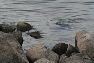 The image I took years ago (as shown on the right) using the faux HDR Toning adjustment to create the HDR style image above.
I love the amount of detail, the textures that I can reveal that were lost in the individual images.
 This above image is playing with the surrealistic effects that can be applied to the image.
The image to the right is mid exposure original image for the two previous images.
 The image I took years ago (as shown on the right) using the faux HDR Toning adjustment to create the HDR style image above.
Monday, April 16, 2012
Advanced Illustrator HW #10 - My Dinner with...
 |
| References |
I was initially going to set the background to an interior bar-room scene and then I found images of these amazing half-timber models which suited the image in my head. The hardest part of this composition was manipulating the cobbled street to match the half-timber models in the background. I did this by starting with a repeatable cobble pattern that I used along the bottom of the image, which I then used the puppet warp tool to warp the cobbles to follow the line of the buildings.
Tuesday, April 10, 2012
Advanced Photoshop HW #9
Using the actions tool helps me to automate certain aspects such as resizing, watermarking and renaming of images. A process that used to take me hours now can be done in a lot less time and can be done with limited user input. Larger batches can be done in the background while I work on other projects. However there are still aspects of the image manipulation process that still requires individual attention particularly the basic photo manipulations, such as levels, which I do for almost all of my photographs.
I used the batch method to apply the re-size action for this and a few other images and used the droplet tool to apply the watermark.
Sunday, April 1, 2012
Advanced Photoshop Midterm - Graffiti SelfPotrait
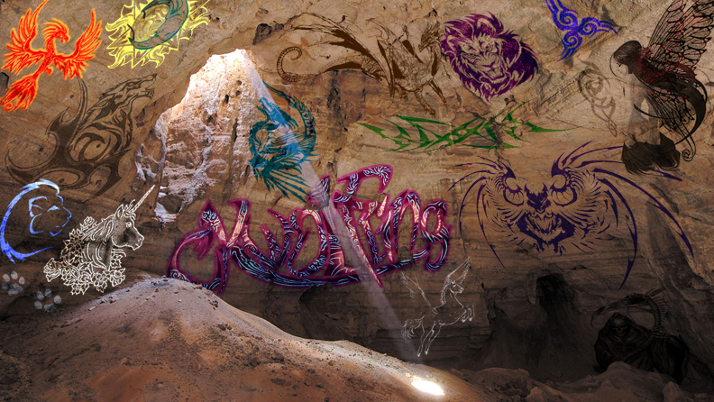 |
| Backgound image: cave |
I looked at many of the "graffiti" fonts at dafont but none suited me, so I looked for "tribal" fonts instead and found this font (tribal 2) which suited my personal style. For the name mark I used the pen tool heavily to alter the letterforms as you can see in the comparison with the original letterforms. I wanted to make the letters distinct enough to be recognizable with minimal overlap, which made the "o" the hardest of the letters to alter.
Saturday, March 10, 2012
Subscribe to:
Posts (Atom)


